Car numbers on rear quarter panels

It looks terrible. It's never been an issue in the sport before so why is it now? It's just another example of their constant need to tinker with things.

We identify by number now more than ever with how often paint schemes and sponsors change from week to week. Relocating and making that key identifier smaller just makes little sense.
 
I don't mind it as a one-off. But only as a one-off...
 
  • Like
Reactions: Pat
Well at the risk of being called touched, death bedder, and whatever else, I hate this idea. Number should be on the side of the car. The number is integral to identifying your favorite driver and since we have an influx of new fans due to NASCAR supporting the BLM movement, I would think the way to identify a driver should stay consistent. Plus it just doesn’t look professional to me, it likes like a paint booth creation from a Gran Turismo game or something of that nature.
 
  • Like
Reactions: Pat
Well at the risk of being called touched, death bedder, and whatever else, I hate this idea. Number should be on the side of the car. The number is integral to identifying your favorite driver and since we have an influx of new fans due to NASCAR supporting the BLM movement, I would think the way to identify a driver would stay consistent. Plus it just doesn’t look professional to me, it likes like a paint booth creation from a Gran Turismo game or something of that nature.

Touched? LMAO.

It's inherently a cosmetic / aesthetic matter, so people are going to have different preferences.

Personally, I'm not that in love with the modern layout in terms of sponsor graphics and numbers. Not enough that I'm opposed to variations.

I believe decades of primary sponsors occupying the same areas of the car that aren't actually the most highly visible have trained the audience's eyes to skip past them. Shaking this up to perhaps increase sponsor visibility and ROI is at least an idea with a purpose, not meaningless tinkering.

I would support teams being given two or three approved layout options.
 
I'm open to this. The stated purpose... "to see if it gives sponsors better branding." If it does work better for sponsors, that means a lot. That means more money for the race teams, which most of them seriously need.

Also, paint schemes on the side of the car can be better. Man, I hate it when the numbers interrupt some righteous flames or scallops on the door.

It looks jarring because it's different. Fans can adjust to that PDQ in my opinion.
 
I'm a little surprised they haven't done this sooner and for the full season because it makes a much larger and cleaner look for a sponsors name, and that is what a sponsor wants. I also think the number on the quarter panel at the back of the car makes it a little easier to see because it is not surrounded by sponsors names. I don't have a problem with it now but I also want to see it going around a track with other cars.
 
Touched? LMAO.

It's inherently a cosmetic / aesthetic matter, so people are going to have different preferences.

Personally, I'm not that in love with the modern layout in terms of sponsor graphics and numbers. Not enough that I'm opposed to variations.

I believe decades of primary sponsors occupying the same areas of the car that aren't actually the most highly visible have trained the audience's eyes to skip past them. Shaking this up to perhaps increase sponsor visibility and ROI is at least an idea with a purpose, not meaningless tinkering.

I would support teams being given two or three approved layout options.
I was called touched in another thread lmao. It’s a first for me
 
Nah I'm not a fan. Heck the numbers are the one truly iconic part of the sport, the font on so many of the numbers hasn't changed for decades
 
and there goes another historical part of nascar, i say no just no!!!!!!!!!:banned:
 
Gluck makes it sound like every team has to do this.

They asked about this in the Fan Council a while back, I guess this was the "winner".

I'm not necessarily against it, I agree the number in the middle of the door is a classic look and the placement is a large part of why a particular number and font can become a part of NASCAR lore, but if it helps with sponsorship recognition it could be hard to argue against. I'll have to see how it looks on an actual car before further judgment.

jNDeEuy.png
 
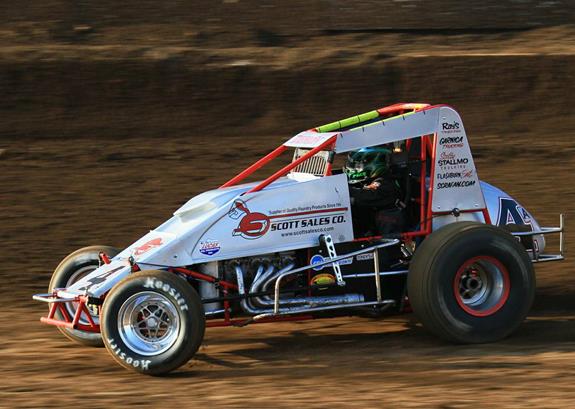
I think the sexiest race cars on the planet look like this

gardner_allen.jpg


so I'm used to numbers occupying minimal real estate.

Yes, they also come with giant billboards strapped to the top, and those are awesome too. In that case I like the number on one end or the other of the wing.

Brad-Sweet-NAPA-AUTO-PARTS-49-World-of-Outlaws-Las-Vegas-2019-feat.jpg


I think that encompasses the sort of sponsor / number synergy that they are trying for here, where you can't look for one without seeing the other.
 
No new sponsor is going to join the sport because of this. They look at the ratings and if they are trending upwards, we may see a couple new sponsors.
I'm optimistic that we won't hear of this again after the All-Star race. Just like the option tire, which we thankfully never saw in a regular race.
 
Just ****** leave it alone. Why do they have to mess with everything? Just NASCAR sacrificing what little identity they have left to shill for sponsor money that probably won’t be there regardless.
 
No new sponsor is going to join the sport because of this. They look at the ratings and if they are trending upwards, we may see a couple new sponsors.
I'm optimistic that we won't hear of this again after the All-Star race. Just like the option tire, which we thankfully never saw in a regular race.

I would surmise that NASCAR executives and teams are trying to address an issue that has been raised explicitly by current and potential sponsors. They didn't make it up.

I am down with an option tire though too.
 
These are some of the most iconic paint schemes ever, I would take my pick with the tried and true method rather than something a "fan council" voted on. Generations and legions of fans were built on these schemes, which if you ask me is more likely than this new potential method of branding. But thats just me. I could be wrong though, and this might be a big hit. Who knows.
1592267501095.png

1592267531991.png

1592267597526.png

1592267659790.png

1592267687331.png

1592267812282.png
 
No new sponsor is going to join the sport because of this. They look at the ratings and if they are trending upwards, we may see a couple new sponsors.
I'm optimistic that we won't hear of this again after the All-Star race. Just like the option tire, which we thankfully never saw in a regular race.
I’m astounded by this post.
 
I'm not, it takes very little to set off a deathbedder stampede
Why are people a death bedder if they disagree with something NASCAR does or particularly don’t care for it? Not everyone here thinks the sky is falling, there are good people on here and fans that might think this change is not their cup of tea
 
Back
Top Bottom