Monster Energy NASCAR Cup Series

The 2 worded Monster NASCAR was better. In advertising, the name matters alot. Starbucks makes millions, because it is a shorter name, as does apple
I must be way out in left field because I have never thought about the length of a name when I buy something. I wouldn't be surprised if Starbucks makes millions because a lot of people buy their over priced terrible tasting coffee because they think they look high class carrying a cup with the name Starbucks on it.:)jmo
 
With the on track product Nascar routinely produces it may not be a bad thing and as long as they have paid for a ticket that is all that really matters. For whatever reason people don't fully engage in work or play anymore as the electronic device they have with them trumps everything. Go to a restaurant and see the couples and families individually hammering away on devices instead of speaking with each other or glance over a the cars you pass and you see the same thing.
You have to look at the bright side. While you may say something wrong no one is listening anyway.
 
I like the slant

I do too. I actually think Andy is technically correct according to current design standards, but my gut reaction is that I like the slant. I think it's the sense of motion that it creates, as without it the logo is too flat and static and like everything else out there at the moment.
 
I do too. I actually think Andy is technically correct according to current design standards, but my gut reaction is that I like the slant. I think it's the sense of motion that it creates, as without it the logo is too flat and static and like everything else out there at the moment.
Hey, if slanted is good enough for this logo, it's good enough for the rest of the sport.

NR204__51441.1403591025.1280.1280.jpg
 
Its a "young" logo. Add this logo to scantily clad girls walking around the pits and drivers talking trash at one another 2017 could be interesting,.,...

Would monster care if drivers hate each other?
Would monster care if drivers punch each other?
Would monster care if the wives hate the monster girls?

Monster wants emotion in the sport. So does NBC.
 
I love reading this logo described with adjectives it would never occur to me to use. Modern, edgy, and now 'young'. What makes it 'young'? o_O I'll avoid any comparisons to Fisher-Price products. :p

Monster is a young brand...the claws make it seem like you are watching adrenaline soaked junkies race around "motocross-esq" to me anyway
 

monster music

Get read for green window bars and green splitter accents in the chase
 
To reiterate, I applaud the new NASCAR logo. I'll gush over how good it is at striking a balance between classic and modern. As for Monster, let's just say that they are very lazy consistent with their motorsports sponsorship branding.

The 2016 Monster Energy Supercross logo:

a3efddb4e9.jpg


If you look carefully, you can trace the evolution from the 2011 Monster Energy Yamaha Supercross logo:

a3efc4cea3.jpg


Now, behold the Monster graphics wizards' creation for the Monster Energy Kawasaki race team:

a3ef8825aa.jpg


It's remarkable how these guys manage to cut and paste adapt to all of these different entities. I don't know if you have heard, but Monster has announced two more new racing sponsorships for 2017.

a41e2f23e7.jpg


a41e3a134d.jpg
 
Monster is a young brand...the claws make it seem like you are watching adrenaline soaked junkies race around "motocross-esq" to me anyway

I am not disagreeing with you as a person sees what they see and perceive what they perceive but I think I would have to be well into the second day of an acid trip to see as much as others do. A quick look says to me the green things look like something a kid would doodle in class....well....they also look like mutant ducks with elongated necks too but that is a different story. The actual "Monster" name in the chosen font looks like something a hair metal band like Quiet Riot, Ratt, Poison or Bon Jovi would have emblazoned on merchandise in an attempt to not look like the posers they are/were.
 
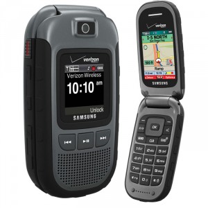
This is my phone. It's a Phone. I can talk to people and even text if I want to go high tech. I got it free when I signed a two year contract with Verizon.

Samsung-Convoy-2-1.jpg

I believe in today's vernacular those phones are referred to as "drug dealer phones."
 
... The actual "Monster" name in the chosen font looks like something a hair metal band like Quiet Riot, Ratt, Poison or Bon Jovi would have emblazoned on
merchandise in an attempt to not look like the posers they are/were.
Thank you! I knew I'd seen that style of demonic wanna-be font in the past. Thanks for reminding me it was from that era.
 
Thank you! I knew I'd seen that style of demonic wanna-be font in the past. Thanks for reminding me it was from that era.

I actually forced myself to look at the logo and that is what I saw and I am glad you did too!
 
I am not disagreeing with you as a person sees what they see and perceive what they perceive but I think I would have to be well into the second day of an acid trip to see as much as others do. A quick look says to me the green things look like something a kid would doodle in class....well....they also look like mutant ducks with elongated necks too but that is a different story. The actual "Monster" name in the chosen font looks like something a hair metal band like Quiet Riot, Ratt, Poison or Bon Jovi would have emblazoned on merchandise in an attempt to not look like the posers they are/were.

you be old :p
 
Back
Top Bottom